I used to hate these things; thinking that it turned the Internet into a generic reading platform (as opposed to a marketing platform), but now I think it’s the other way around.
Publishers aren’t good at designing business models online, most cloak inside a big publishing category, and there are few interesting and identifiable identities. If one could adopt more of the principles behind these kinds of presentation designs, it would be a starting point to create stronger identities, better experiences and hopefully more viable business models.
The service I’m talking about is Arc 90’s Readability, aimed at simplifying the presentation of content so as to make it more readable. But what happens is more than that…
Readability – Installation Video for Firefox, Safari & Chrome from Arc90 on Vimeo.
The removal of all the strongly colored, moving shapes of inefficient advertising (business model wise), all the disarranged forms of hyperlinks and navigation scattered around the page (to get more page views) adds up to quite an efficient interface giving the reader more time to enjoy the content, mull over it, get more value from it – compared to when it is presented in a rushed, hectic navigation environment.
Now I’m not saying that it is the lack of graphical elements that are making this environment better, I’m not. It’s the lack of intense navigational and commercial noise aimed at supplementing a business model designed to generate clicks and views. Which is an infrastructure business model for advertising, a business model that has been proven not to work:
- 1. Digital, often representing half or more than half of a publication’s readers generate only 5% of a publisher’s income. (link)
2. There is an increase in earnings from subscription models, while the advertising revenue is declining. (Add to this recent news that a large Norwegian publishers is earning four times as much money from its niche subscription products compared to all its display advertising – the infrastructure business model’s future looks bleak.)
Publishers need to enhance the experience of their environments by designing them through their identities; their value proposition, mantra, promise to the customer etc. (Through the application of design and form in order to enhance the value of the content AND the environment).
Today the generic standard publishing interface is overly linking up every piece of content in every direction in what ends up to be a navigational piece of content rather than a valuable piece of content.
Secondly, most publishers today present their content in generic CMS-publishing windows where there is little brand, no identity, just more of the same publishing “cate-orgy”
. :) (There are exceptions of course)
As the Future Media presentation suggests, the value for publishers is not from their advertising, but from offering readers, subscribers and even members, a unique, valuable experience over time (content is created in collaboration with companies). This is achieved both through more interesting, scarce content, and better environments for extracting value from it.
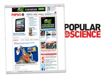
The Popular Science iPad application, although tailored for that specific platform, is a long way ahead. And is in stark contrast to the experience Popular Science invites people to in their “browsered” environment
3. Appropriate therapy for hormonal abnormalities (e.g.and androgens in general should not be recommended as How to use sildenafil citrate tablets.
.

I suggest that it is – in the interface between / by understanding the principles of – the Popular Science iPad application and the Readability application publishers must explore, in order to design more interesting, unique and valuable identities for their browser based content, enabling them to discover new business models.


Could not agree more. Nothing is more annoying than a site with too much noise. I recently visited a news source I am fond of for the first time online and was appalled at how poor the navigation and packaging are, especially with the talented staff writers they have. Bleh.
Hi There
You should also look at instapaper (instapaper.com) . Does a really nice job, and you can save articles to your “library”. If you use a kindle, ipad/iphone you can access through those as well.
#Mike, we share the same frustration :)
#Nick I agree Nick, Instapaper makes the same point.